Popular brands like Walmart, Coach, Burberry, and Nike are instantly recognizable by their logos. For example, Burberry’s logo features a bespoke version of Bodoni, which reflects the brand’s “quiet luxury” vibe. Toys “R” Us, on the other hand, uses a playful font with bold strokes.
The adage, “It’s not what you say, it’s how you say it,” applies to branding, too. Your logo, including its colors, fonts, and overall layout, speaks volumes about your business. These visual elements can convey different messages and shape consumer perception.
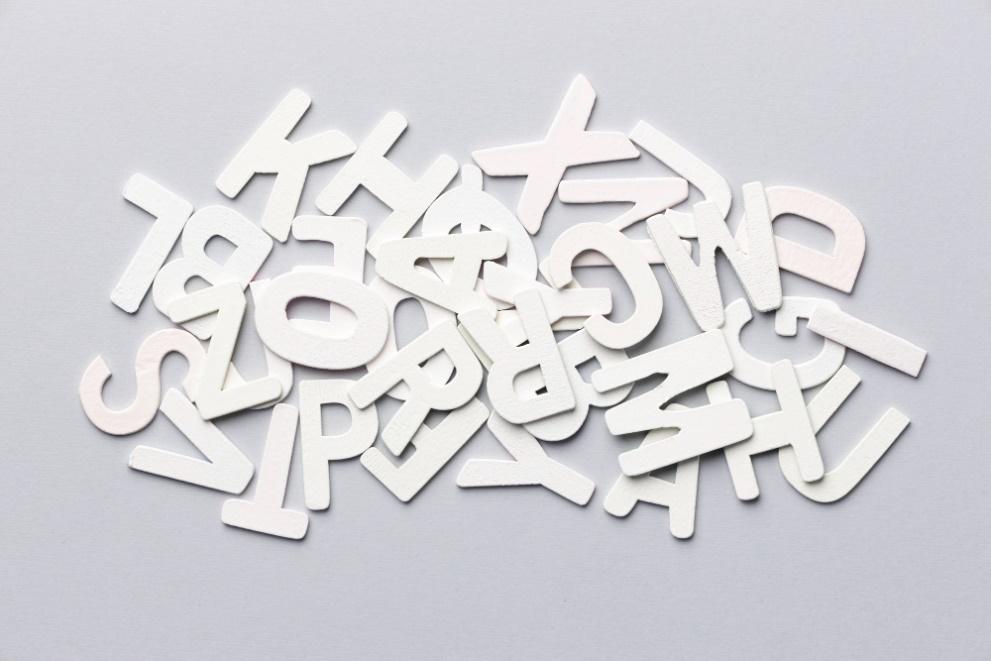
With that in mind, use a logo maker to explore various font combinations and color palettes. For instance, you can see what your logo would look like in different fonts, such as Didot, Rockwell, or Bebas Neue.
Look beyond aesthetics when choosing a font. Consider its meaning and the emotions it evokes, as well as your brand’s personality and style. Here are some tips to help you out.
Font Psychology 101: What Different Types of Fonts Mean
Each font triggers a different visual and emotional reaction. For instance, serif typefaces, which include fonts like Georgia, Cambria, and Times New Roman, have a formal feel to them. They’re associated with tradition, stability, and professionalism, evoking a sense of trust.
Most fonts fall into four categories:
- Serif: Use serif fonts to instill a sense of authority and timelessness
- Sans-serif: These fonts are bold, creative, and modern, conveying a sense of innovation
- Script: Show your creative side and add a personal touch with script fonts
- Display: These are custom fonts made for specific brands, so they have a distinct feel
Let’s say you plan to sell educational toys for children. You want to be perceived as professional, so you decide to use serif fonts in your logo and marketing materials.
However, these fonts may not be the best choice for a brand targeting children. Instead, look into sans serif, script, or display fonts, which have a less formal feel.
For instance, LEGO’s logo uses display fonts. These are bold, modern, and eye-catching and can be tailored to a brand’s image.
Similarly, a playful font like CA Negroni or CA Cape Rock creates a different emotional response than Libre Baskerville or other traditional fonts.
That said, consider your target audience and the message you want to convey with your logo. Research the different types of fonts and their meanings, pick three or four, and then create logo mockups.
Take into account the following aspects, too.
Keep It Simple
As a general rule, use no more than two or three fonts in your logo. These should complement each other and follow a visual hierarchy.
For example, Raleway and other sans-serif fonts work well with serif fonts. This combo creates contrast, guiding the viewer’s eye.
Always use fonts from the same family to achieve a balanced design. However, avoid pairing fonts that look pretty much the same, as it can dilute the visual impact and make the text harder to read.
Balance Aesthetics and Readability
According to researcher Nick Kolenda, our brain associates different fonts with different shapes and other visual attributes.
For instance, bold fonts are powerful and masculine, while those with long, thin lines convey beauty. Round fonts instill a sense of comfort, whereas angular fonts convey authority.
The appearance of a font also impacts its readability. As Kolenda notes, the most readable fonts are those that:
- Have mixed case letters
- Are medium weight (e.g., Helvetica Neue Medium, Open Sans Medium)
- Feature a simple layout
Visual appeal matters, but you must also consider the legibility of your font.
Zapfino, for example, features intricate details and elegant letterforms. At first glance, it seems like a good choice for fashion or jewelry brands. However, its flourishes and washes can make it challenging to read.
A better choice is Helvetica, Arial, Open Sans, Georgia, or Times New Roman. Calibri, Oswald, and Montserrat are easy to read, too. With their clean, modern look, these fonts balance aesthetics and functionality.
Look at the Big Picture
Before choosing a font, think about what you want your logo to look like.
Are you going to use a colorful design with lots of details? Then go for a thin font like Blissful, Gardner, Venge, or Revaux.
Bold or intricate fonts can complement a more simplistic logo design. An example would be Vergilia, League Spartan, or Yellowtail.
Also, test the font across various mediums and devices. Some fonts look great on screens but may not be suitable for print—or the other way around. Additionally, fonts with intricate details can lose their clarity on low-resolution devices or textured paper.
That said, consider where and how you’re going to use your logo. If you plan to promote your brand online and offline, select a font that’s suitable for both web and print projects, such as Quatera, Pontiac, or Maine.
Take Inspiration from Other Brands
Look up the brands you love and take note of their logo design and fonts. Do the same with your competitors or other businesses in your industry.
Let’s assume you want to build a fitness brand. Perhaps you plan to sell sports apparel or footwear. In this case, take inspiration from top brands like Nike, Adidas, New Balance, and Under Armour.
For example, New Balance features the company’s name and initials in its logo. It uses the ITC Avant Garde Gothic Demi bold font, with the monogram being intersected by lines that symbolize speed, energy, and motion.
Think about the message you’re trying to convey. Then look for brands with a similar mission as you to see what colors, shapes, and fonts they use in their logos—and the meaning behind them.
Don’t Fall for the Latest Trends
Last but not least, steer clear of trendy fonts like Super Vibes, Binlay, Atleigh Typeface, or Scalone. These look pretty cool but might go out of style a few years from now on. You’ll also want to avoid popular fonts, such as Brush Script and Trojan Pro, as they are overused.
Your best bet is to pair traditional fonts that consumers are familiar with. Experiment with different combinations, test their legibility, and ask for feedback.

Editorial Team
The Editorial Team at GoOnlineTools.com specializes in delivering cutting-edge information on technology.
View all postsComments 0
No comments yet. Start the conversation!